SweepWidget Design Options: Complete Styling Guide
SweepWidget offers extensive design customization options to help you create giveaways that perfectly match your brand. This comprehensive guide covers every setting available in the Design tab, from basic media options to advanced styling controls.
Accessing Design Options
To access design options:
- Create or edit a giveaway
- Click on the Design tab in the left sidebar
The Design tab has two views:
- Basic view – Shows featured media, background, and logo options
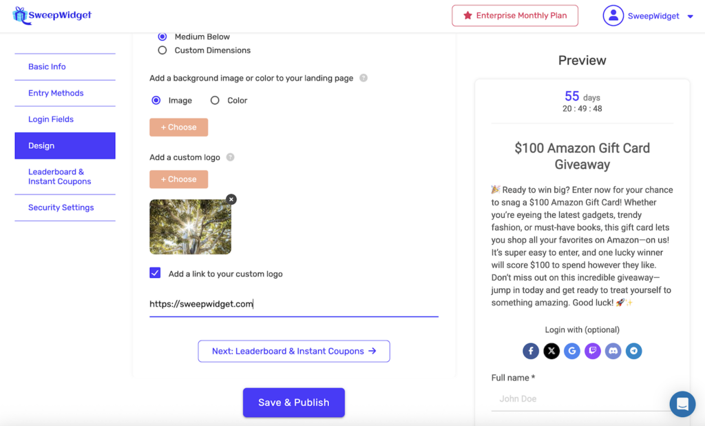
- Expanded view – Click + Add Custom Styling To Form to reveal all style settings
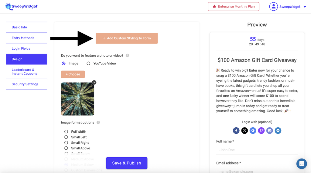
Basic Design Options
Featured Photo or Video
Add visual media to your giveaway widget to showcase prizes or enhance engagement.
| Option | Description |
|---|---|
| Image | Upload a photo or graphic (JPG, PNG, GIF, WebP) |
| YouTube Video | Embed a YouTube video by pasting the URL |
Image Format Options
When using an image, choose how it displays in the widget:
| Format | Description | Best For |
|---|---|---|
| Full Width | Large image spanning 100% width at top of widget | Hero images, banners |
| Small Left | Small image floated left, text wraps right | Product thumbnails |
| Small Right | Small image floated right, text wraps left | Product thumbnails |
| Small Above | Small centered image between title and description | Icons, small products |
| Small Below | Small centered image below description | Secondary visuals |
| Medium Above | Medium centered image between title and description | Product photos |
| Medium Below | Medium centered image below description | Product photos |
| Custom Dimensions | Specify exact width and/or height in pixels | Precise sizing needs |
Custom Dimensions Tip: To maintain proportions, enter only width OR height (leave the other at 0). The image will scale proportionally.
Background Image or Color
Customize the hosted landing page background:
| Option | Description |
|---|---|
| Image | Upload a background image (displays as cover) |
| Color | Choose a solid color or gradient using the color picker |
Note: Background settings only apply to the hosted landing page, not embedded widgets.
Custom Logo
Add your brand logo to the hosted landing page header. The logo appears above the widget and can link to a URL of your choice.
Style Settings (Expanded View)
Click + Add Custom Styling To Form to access detailed styling controls.
White-Labeling
At the top of Style Settings, you’ll find:
Remove SweepWidget branding (top logo + “Powered by SweepWidget” footer)
Check this box to remove all SweepWidget branding for a fully white-labeled experience. Available on Business plan and above.
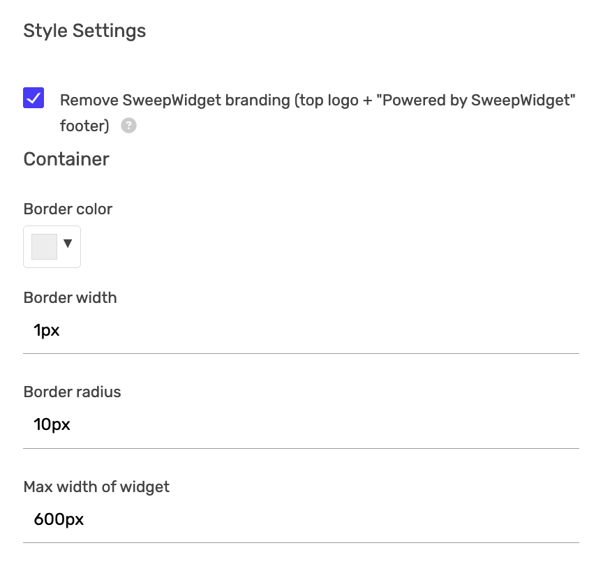
Container Settings
Control the overall widget container appearance:
| Setting | Description | Default |
|---|---|---|
| Border color | Color of the widget border | #eeeeee (light gray) |
| Border width | Thickness of the border in pixels | 1px |
| Border radius | Corner roundness in pixels (0 = square corners) | 10px |
| Max width of widget | Maximum width the widget can expand to | 600px |
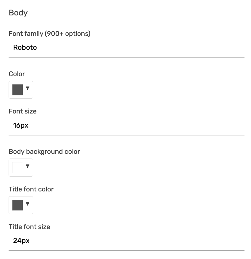
Body Settings
Customize fonts and colors for the main widget content:
| Setting | Description | Default |
|---|---|---|
| Font family | Choose from 900+ Google Fonts | Roboto |
| Color | Main body text color | #555555 |
| Font size | Body text size in pixels | 16px |
| Body background color | Background color of the widget body | #ffffff (white) |
| Title font color | Color of the giveaway title | #555555 |
| Title font size | Size of the giveaway title in pixels | 24px |
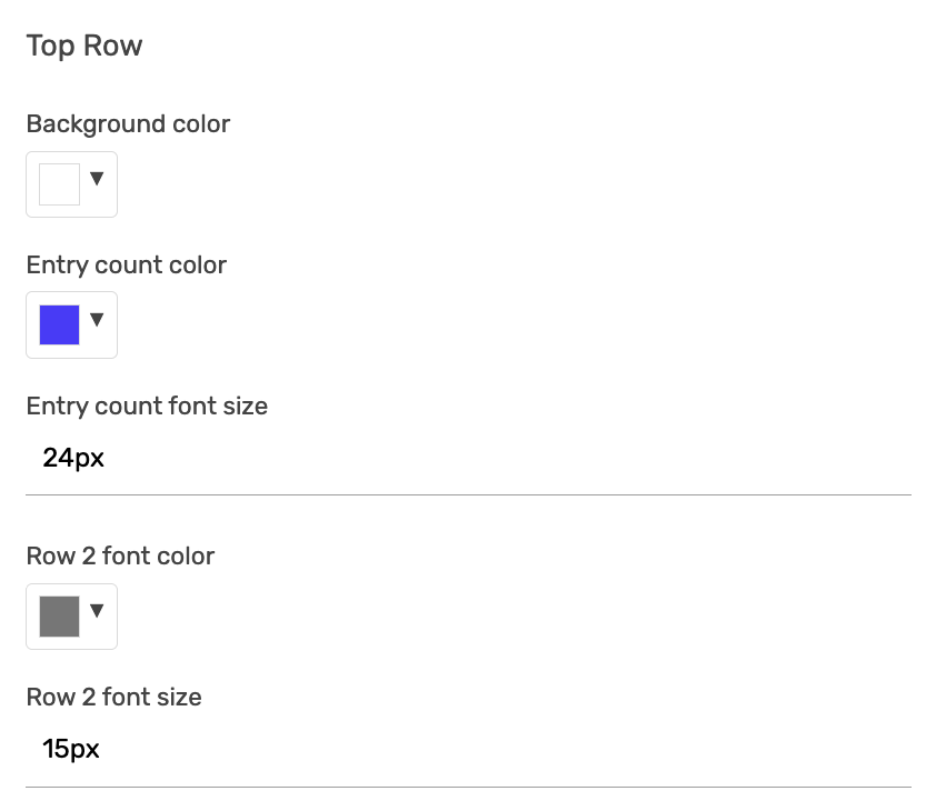
Top Row Settings
The top row displays the countdown timer and entry counts. Customize its appearance:
| Setting | Description | Default |
|---|---|---|
| Background color | Background of the top stats row | #ffffff (white) |
| Entry count color | Color of the entry count numbers (e.g., “55”) | #4a3aff (purple/blue) |
| Entry count font size | Size of entry count numbers | 24px |
| Row 2 font color | Color of labels like “Days”, “My Entries” | #777777 (gray) |
| Row 2 font size | Size of the label text | 15px |
| Countdown subtitle text | Custom text displayed centered below the countdown and entry count boxes (e.g., “30 Days till winner is picked!”) | Empty (none) |
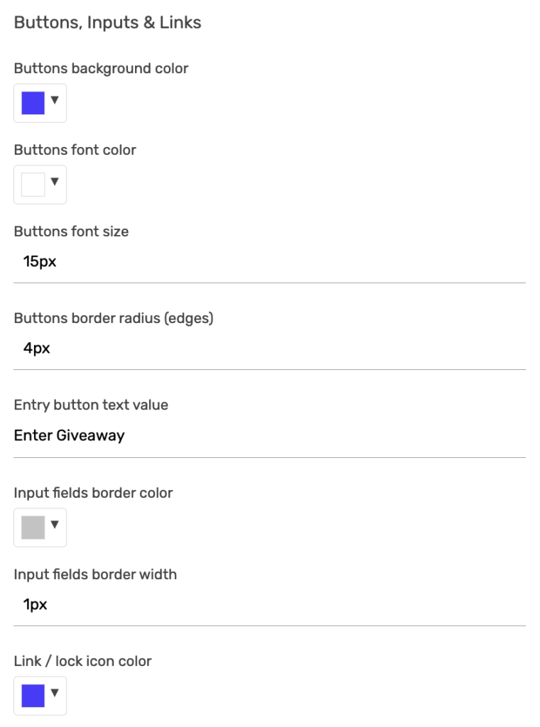
Buttons, Inputs & Links Settings
Control the appearance of interactive elements:
Buttons
| Setting | Description | Default |
|---|---|---|
| Buttons background color | Background color of all buttons | #4a3aff (purple/blue) |
| Buttons font color | Text color on buttons | #ffffff (white) |
| Buttons font size | Button text size in pixels | 15px |
| Buttons border radius (edges) | Corner roundness of buttons | 4px |
| Entry button text value | Text displayed on the main entry button | “Enter Giveaway” |
Input Fields
| Setting | Description | Default |
|---|---|---|
| Input fields border color | Border color of text inputs | #c4c4c4 (light gray) |
| Input fields border width | Border thickness of inputs in pixels | 1px |
Links & Icons
| Setting | Description | Default |
|---|---|---|
| Link / lock icon color | Color of links and lock icons | #4a3aff (purple/blue) |
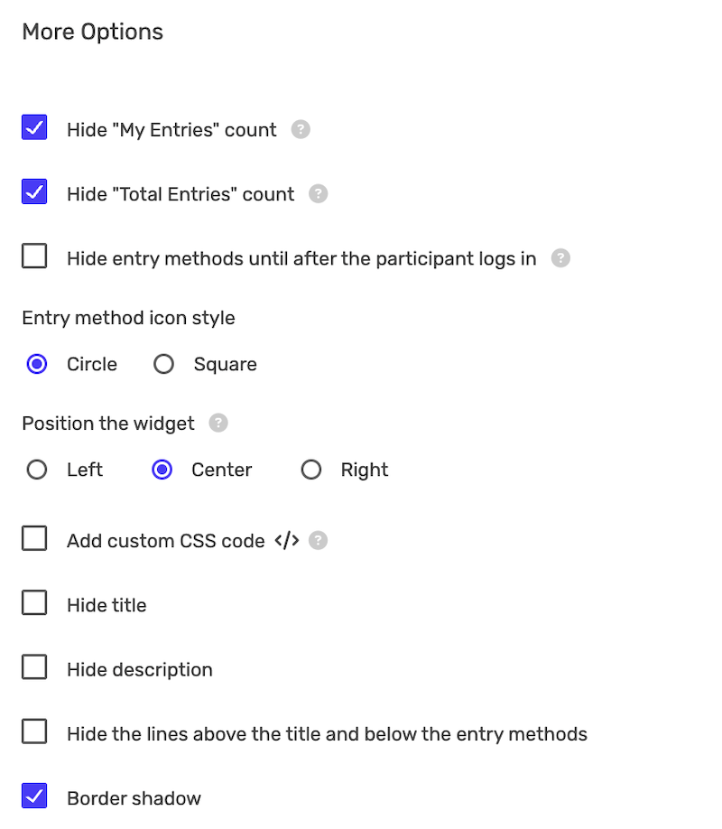
More Options
Additional display and visibility settings:
Entry Count Visibility
| Setting | Description |
|---|---|
| Hide “My Entries” count | Hides the participant’s personal entry count |
| Hide “Total Entries” count | Hides the total entries from all participants |
Entry Methods Display
| Setting | Description |
|---|---|
| Hide entry methods until after the participant logs in | Only shows entry methods after user enters their details |
| Entry method icon style | Choose Circle or Square icons for entry methods |
Widget Position
| Option | Description |
|---|---|
| Left | Aligns widget to the left of the page |
| Center | Centers the widget (default) |
| Right | Aligns widget to the right of the page |
Custom CSS
Check Add custom CSS code to open a CSS editor for advanced styling beyond the built-in options.
Content Visibility
| Setting | Description |
|---|---|
| Hide title | Removes the giveaway title from display |
| Hide description | Removes the description text |
| Hide the lines above the title and below the entry methods | Removes separator lines for a cleaner look |
Visual Effects
| Setting | Description | Default |
|---|---|---|
| Border shadow | Adds a subtle drop shadow around the widget | Enabled |
Complete Settings Reference
Here’s a quick reference of all design settings with their default values:
| Category | Setting | Default Value |
|---|---|---|
| Container | Border color | #eeeeee |
| Container | Border width | 1px |
| Container | Border radius | 10px |
| Container | Max width | 600px |
| Body | Font family | Roboto |
| Body | Text color | #555555 |
| Body | Font size | 16px |
| Body | Background color | #ffffff |
| Body | Title color | #555555 |
| Body | Title size | 24px |
| Top Row | Background color | #ffffff |
| Top Row | Entry count color | #4a3aff |
| Top Row | Entry count size | 24px |
| Top Row | Label color | #777777 |
| Top Row | Label size | 15px |
| Top Row | Countdown subtitle text | Empty (none) |
| Buttons | Background color | #4a3aff |
| Buttons | Font color | #ffffff |
| Buttons | Font size | 15px |
| Buttons | Border radius | 4px |
| Buttons | Entry button text | Enter Giveaway |
| Inputs | Border color | #c4c4c4 |
| Inputs | Border width | 1px |
| Links | Link/icon color | #4a3aff |
Design Tips & Best Practices
- Match your brand colors – Use your brand’s primary color for buttons and accent elements
- Keep it readable – Ensure sufficient contrast between text and background colors
- Use the preview – Changes appear in real-time in the preview panel on the right
- Test on mobile – Preview how your design looks on smaller screens
- Start with defaults – The default settings work well for most cases; customize only what you need
- Use consistent fonts – Choose a font family that matches your website
- Consider white-labeling – For professional presentations, remove SweepWidget branding
- Use Custom CSS sparingly – Only use when built-in options don’t meet your needs
Common Customization Examples
Minimal/Clean Design
- Hide title and description lines
- Hide entry counts
- Set border width to 0
- Disable border shadow
Bold/High Contrast Design
- Use your brand’s primary color for buttons
- Increase button font size
- Use a bold button border radius (20px+ for pill-shaped)
- Add a background color or image to the landing page
Professional/Corporate Design
- Enable white-labeling
- Add your company logo
- Use your corporate font family
- Set button border radius to 0 for square buttons
- Use subtle, professional colors
Plan Requirements
Most design options are available on all plans. Some features require specific plans:
| Feature | Required Plan |
|---|---|
| Basic design options | All plans (including Free) |
| White-labeling (remove branding) | Business and above |
| Custom CSS | Pro and above |
| Custom logo | All plans |