Custom CSS For A SweepWidget Giveaway
The custom CSS editor gives you complete control over the design of your SweepWidget giveaway. Target any element by its CSS class or ID to customize colors, fonts, spacing, borders, and more.
Plan Required: Premium or higher
Works on: Landing pages and embedded widgets
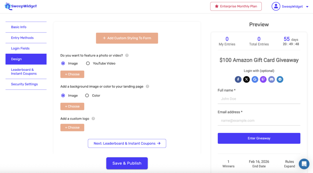
How to Access the Custom CSS Editor
- Create or edit a giveaway
- Click on the Design tab in the left sidebar
- Click the + Add Custom Styling To Form button
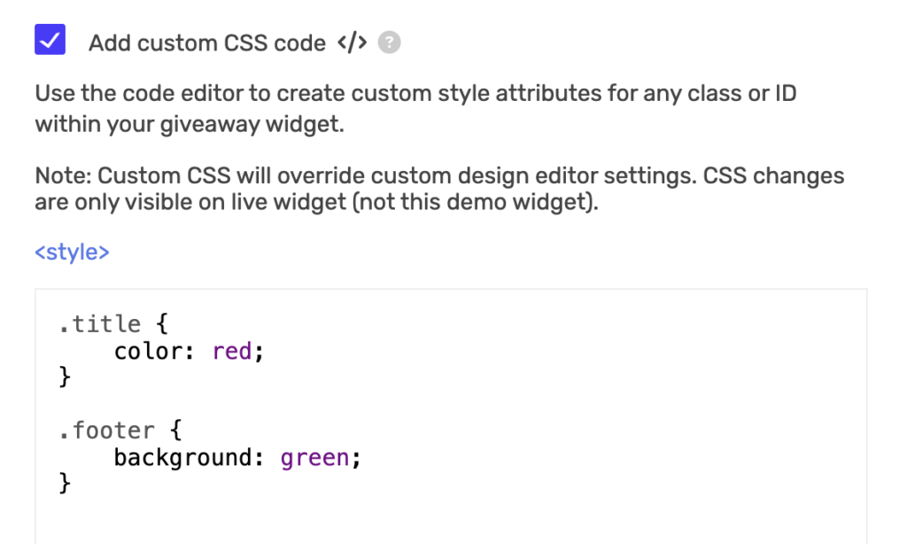
- Check the Add custom CSS code </> checkbox
- Enter your CSS code in the editor
Important Notes
!importantis automatically applied – SweepWidget automatically adds!importantto all your CSS declarations. This ensures your styles override the widget’s inline styles. You do not need to add!importantyourself.- Custom CSS overrides design editor settings – Your CSS takes priority over the visual style settings in the builder.
- CSS changes are only visible on the live widget – The preview/demo widget in the builder will not show your CSS changes. You must view the live giveaway to see your styling.
- No
<style>tags needed – The editor already wraps your code in style tags. Just write your CSS rules directly. - Works on embedded widgets too – Custom CSS is applied to both landing page giveaways and embedded widgets (iframe/JavaScript embed).
- All CSS features supported – You can use any valid CSS including
rgba(),calc(),var(),linear-gradient(), attribute selectors, media queries, and more.
CSS Selectors Reference
Below is a complete reference of all targetable CSS selectors in SweepWidget. IDs (prefixed with #) are unique per widget and are the most reliable way to target specific sections. Classes (prefixed with .) may appear on multiple elements.
Widget Structure
| Selector | Element |
|---|---|
.sw_container |
Outer widget container (outermost wrapper) |
.sw_container_inner |
Inner container wrapper |
#sw_inner |
Main widget area |
#widget_title |
Giveaway title |
#widget_description |
Description text area |
#sw_featured_media |
Featured image or video container |
Top Stats Bar
| Selector | Element |
|---|---|
#sw_stats_bar |
Stats bar container (my entries, total entries, timer) |
#sw_top_1 |
My entries column |
#sw_top_2 |
Total entries column |
#sw_top_3 |
Countdown timer column |
#clockdiv |
Countdown timer numbers |
#sw_my_entries |
My entries count number |
#sw_total_entries_count_all |
Total entries count number |
Login / Entry Form
| Selector | Element |
|---|---|
#sw_login_form |
Login form container |
#sw_login_fields |
Login fields wrapper |
#sw_login_button |
Login / enter button |
#sw__login_name_wrapper |
Name input wrapper |
#sw__login_email_wrapper |
Email input wrapper |
#sw__login_phone_wrapper |
Phone input wrapper |
#sw__login_birthday_wrapper |
Birthday input wrapper |
#sw_social_login |
Social login buttons section |
.sw_text_input |
All text input fields |
.sw_textarea |
All textarea fields |
.social_login_button_holder |
Individual social login button |
Entry Methods
| Selector | Element |
|---|---|
#sw_entry_methods |
Entry methods section container |
.sw_entry |
Each entry method row |
.sw_entry_h_1 |
Entry method header (collapsed state) |
.sw_entry_input |
Entry method expanded content |
.sw_text_inner_text |
Entry method name text |
.sw_entries_worth |
Entry count badges (e.g., “+5 entries”) |
.entry_icon_path_display |
Entry method icon |
#tabs_wrapper |
Tabs container (entries / my entries / leaderboard) |
#leaderboard_wrapper |
Leaderboard section |
Buttons
| Selector | Element |
|---|---|
.sw_verify |
Verify / submit buttons on entry methods |
.sw_login_input |
Login submit button |
.sw_share_btn |
Social share buttons |
.sw_copy_clipboard |
Copy link button |
.sw_link |
Links and action buttons within the widget |
Bottom Section
| Selector | Element |
|---|---|
#sw_bottom_bar |
Bottom bar container (prizes, end date, rules) |
#sw_prizes_column |
Prizes column |
#sw_end_date_column |
End date column |
#sw_rules_column |
Rules column |
#sw_footer |
Footer area (expanded prizes/rules content) |
#sw_contest_prizes_holder |
Prizes expanded content |
#sw_contest_rules_holder |
Rules expanded content |
#sw_attribution |
“Built with SweepWidget” attribution footer |
User Account, Rewards, and Other
| Selector | Element |
|---|---|
#sw_user_account_holder |
User account details section |
#sw_logout_link_holder |
Logout / account bar |
#verify_email_wrapper |
Email verification modal |
#unlock_rewards_main_wrapper |
Rewards / milestones section |
.unlock_rewards_row |
Individual reward row |
.leaderboard_row |
Leaderboard entry row |
.leaderboard_rank |
Rank number in leaderboard |
.leaderboard_name |
Name in leaderboard |
.leaderboard_amount |
Entry amount in leaderboard |
CSS Examples
Remember: !important is automatically added to all declarations, so you do not need to include it yourself. The examples below show clean CSS without !important.
Change the Widget Title
#widget_title {
    color: #333;
    font-size: 28px;
    font-weight: bold;
    text-align: center;
}
Style the Description
#widget_description {
    font-size: 16px;
    line-height: 1.6;
    color: #555;
}
Style Entry Method Rows
.sw_entry_h_1 {
    border-left: 4px solid #4a3aff;
    margin-bottom: 10px;
    padding: 15px;
    border-radius: 8px;
}

.sw_entry_h_1:hover {
    background: #f5f5f5;
    transform: translateX(5px);
}
Style the Login Button
#sw_login_button {
    background: #ff6600;
    border-radius: 25px;
    font-weight: bold;
    text-transform: uppercase;
}

#sw_login_button:hover {
    background: #cc5200;
}
Style Input Fields
.sw_text_input {
    border: 2px solid #ddd;
    border-radius: 8px;
    padding: 12px;
}

.sw_text_input:focus {
    border-color: #4a3aff;
    box-shadow: 0 0 5px rgba(74, 58, 255, 0.3);
}
Style the Entry Points Badges
.sw_entries_worth {
    background: #4a3aff;
    color: white;
    border-radius: 50%;
    font-weight: bold;
}
Change Font Family
.sw_container {
    font-family: 'Poppins', sans-serif;
}

#widget_title {
    font-family: 'Montserrat', sans-serif;
}
Style the Stats Bar
#sw_stats_bar {
    background: #1a1a2e;
    color: white;
    border-radius: 8px;
    padding: 10px;
}

#clockdiv {
    color: #e94560;
    font-weight: bold;
}
Style the Bottom Bar
#sw_bottom_bar {
    background: #f8f9fa;
    border-top: 2px solid #eee;
    padding: 15px;
}

#sw_prizes_column {
    color: #28a745;
    font-weight: bold;
}
Hide an Element
#sw_attribution {
    display: none;
}
Add a Border to the Widget
.sw_container {
    border: 2px solid #333;
    border-radius: 10px;
    box-shadow: 0 4px 6px rgba(0, 0, 0, 0.1);
}
Style the Leaderboard
.leaderboard_row {
    background: linear-gradient(135deg, #667eea 0%, #764ba2 100%);
    color: white;
    border-radius: 8px;
    margin-bottom: 5px;
}

.leaderboard_rank {
    font-weight: bold;
    font-size: 18px;
}
Style the Featured Image
#sw_featured_media img {
    border-radius: 12px;
    box-shadow: 0 4px 12px rgba(0, 0, 0, 0.15);
}
Dark Theme Example
.sw_container {
    background: #1a1a2e;
    color: #eee;
}

#sw_inner {
    background: #16213e;
}

.sw_entry_h_1 {
    background: #0f3460;
    color: #eee;
    border-color: #e94560;
}

.sw_text_input {
    background: #16213e;
    color: #eee;
    border-color: #0f3460;
}

#sw_stats_bar {
    background: #0f3460;
}

#sw_bottom_bar {
    background: #16213e;
    border-color: #0f3460;
}
Mobile-Responsive CSS
You can use media queries to apply different styles on mobile devices:
/* Desktop styles */
#widget_title {
    font-size: 28px;
}

.sw_entry_h_1 {
    padding: 20px;
}

/* Mobile styles */
@media (max-width: 768px) {
    #widget_title {
        font-size: 20px;
    }

    .sw_entry_h_1 {
        padding: 12px;
    }
}
Finding CSS Selectors with Browser DevTools
To find the exact CSS class or ID for any element:
- Open your live giveaway in a browser
- Right-click on the element you want to style
- Select Inspect (or Inspect Element)
- The developer tools will highlight the HTML element and show its classes and IDs
- Use those class names (with a
.prefix) or IDs (with a#prefix) in your CSS
The selectors reference tables above cover all major widget sections, but you can use this method to find additional classes on specific elements.
Troubleshooting
CSS not appearing on the widget
- CSS only shows on the live widget, not the preview in the builder
- Make sure you saved your giveaway after adding CSS
- Clear your browser cache and refresh the page
- Check for syntax errors like missing semicolons, brackets, or colons
Styles not applying
- Since
!importantis auto-applied, your styles should override widget defaults. If they still don’t apply, try making your selector more specific (e.g.,.sw_container #widget_titleinstead of just#widget_title) - Use browser DevTools to check if another rule is conflicting
- Make sure your CSS syntax is valid. A single syntax error can break all rules that follow it.
CSS works on landing page but not embedded widget
- Custom CSS works on both landing pages and embedded widgets. If it is not applying to the embed, make sure you saved and republished the giveaway.
- If you are using an iframe embed, custom CSS is injected inside the iframe automatically.
Tips
- Use IDs for precision – Target elements with
#idselectors for the most reliable results. IDs are unique per element and won’t accidentally style the wrong thing. - Test on mobile – Use media queries to ensure your styles look good on all screen sizes.
- Back up your CSS – Keep a copy of your CSS code in a text file in case you need to restore it.
- Use browser DevTools – Right-click any element and select “Inspect” to see its exact class names and IDs.
- Keep it simple – Start with small changes and build up. It is easier to debug a few rules at a time.