Custom Style Your Giveaway
Learn how to add a custom style and design to your giveaway. This is beneficial for seamlessly integrating SweepWidget with your brand. Or, maybe you just like design and want to spice things up!
Table of contents:
- Getting started
- Reset to default
- Hide title
- Hide description
- Classic VS bubbly entry method style
- Style: container
- Style: body
- Style: top row
- Style: buttons, inputs & links
- Save your design
Find additional design tips here.
Getting Started
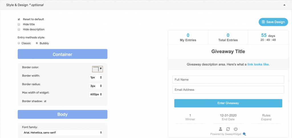
Navigate to the Style & Design tab, then click the Style Your Widget button at the top.

All of the style options will be in the left nav and a demo widget will be in the right. You will be able to test design edits in real time.
Reset to default
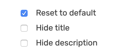
Tick the Reset to default checkbox to restore the design to it’s default setting.
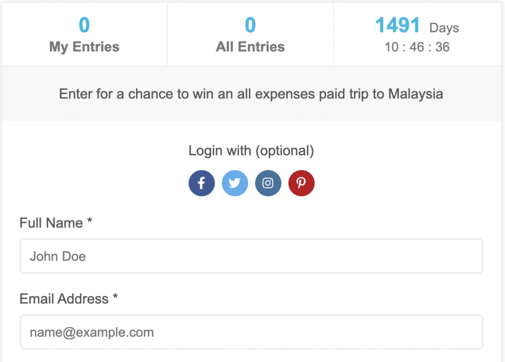
Hide title
Admin view
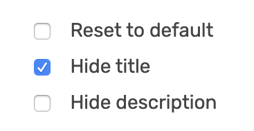
Tick the Hide title checkbox to hide the title.
Public view
As you can see, the title is hidden on the live giveaway.
Hide description
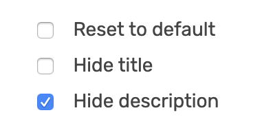
Admin view
Tick the Hide description checkbox to hide the description.
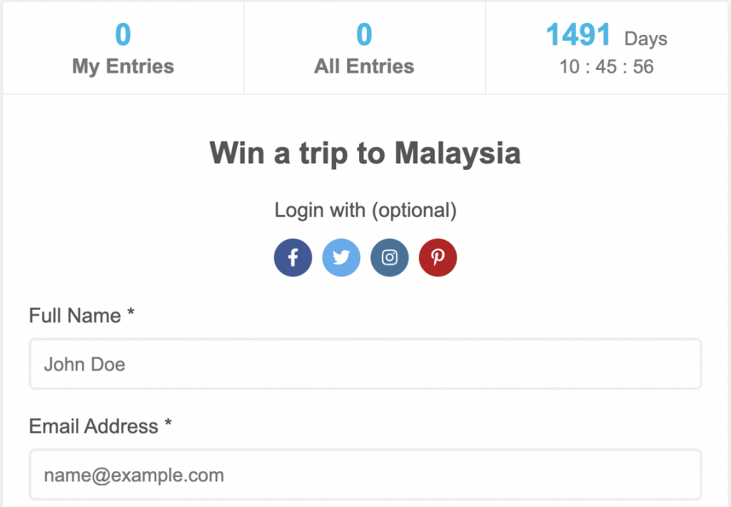
Public view
As you can see, the description is hidden on the live giveaway.
Note: you can hide both the title and description if you want.
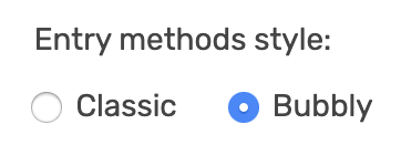
Classic VS bubbly entry method style
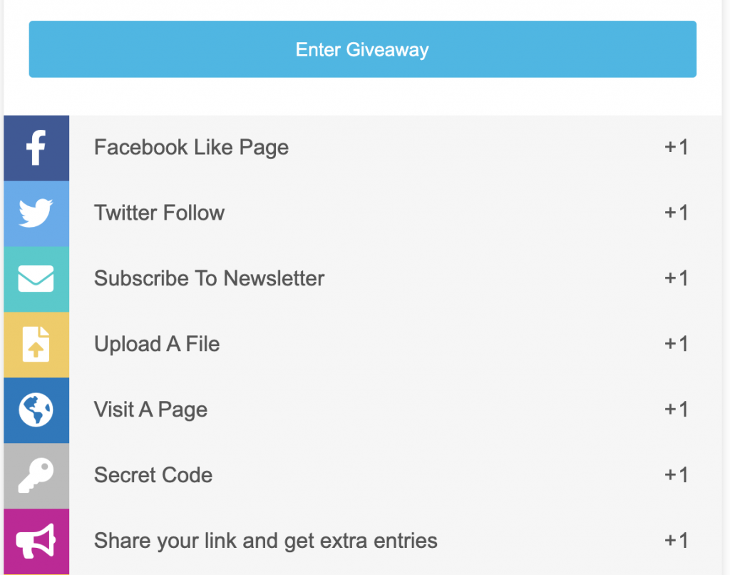
Classic
The classic style has square icons with each entry method nested together.
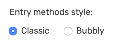
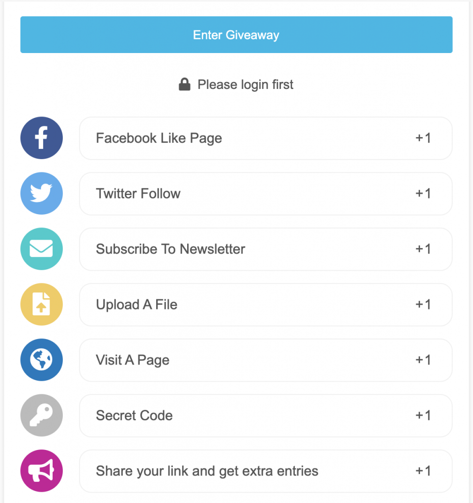
Bubbly
The bubbly style has circular icons with more padding.
Style: container
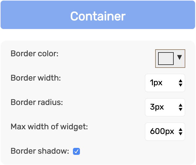
These style options allow you to edit the following parts of the widget container:
- Border color
- Border width
- Border radius (rounded edges)
- Max width of the widget (widget is responsive up to this widget)
- Border shadow (on/off)
Style: body
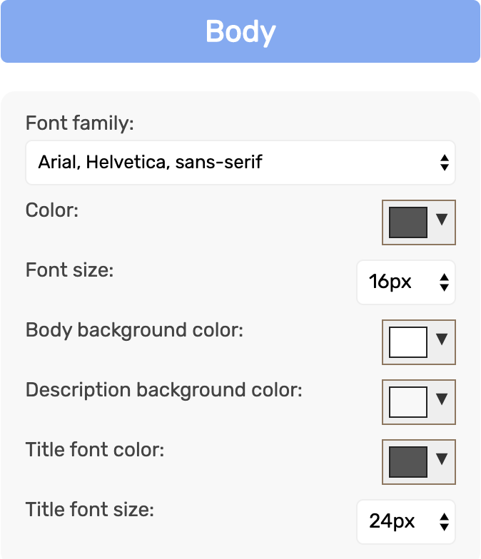
These style options allow you to edit the following parts of the widget body:
- Font family
- Color
- Font size
- Body background color
- Description background color
- Title font color
- Title font size
Style: top row
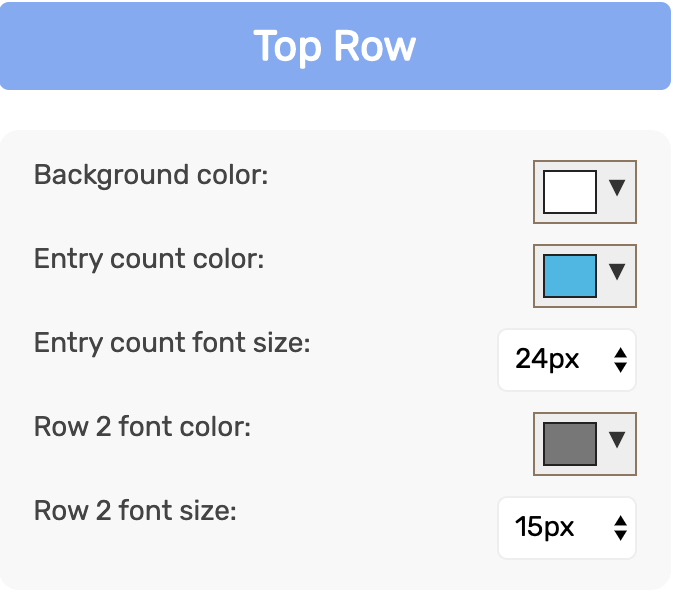
These style options allow you to edit the following parts of the widget top row:
- Background color
- Entry count font color
- Entry count font size
- Row 2 font color
- Row 2 font size
Style: buttons, inputs & links
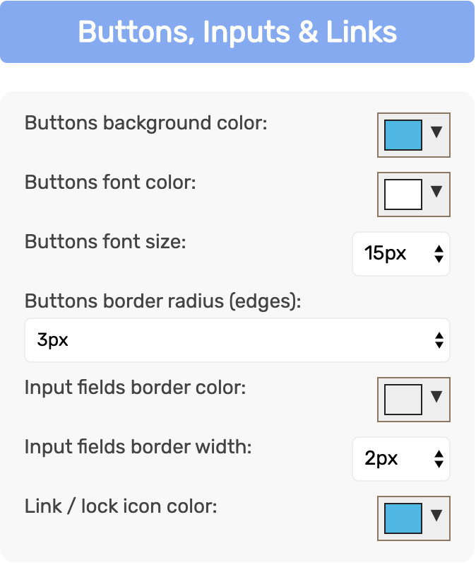
These style options allow you to edit the following parts of the widget:
- Buttons background color
- Buttons font color
- Buttons font size
- Buttons border radius (rounded edges)
- Input fields border color
- Input fields border width
- Link / lock icon color
Save your design
Click the Save Design button to save your work.
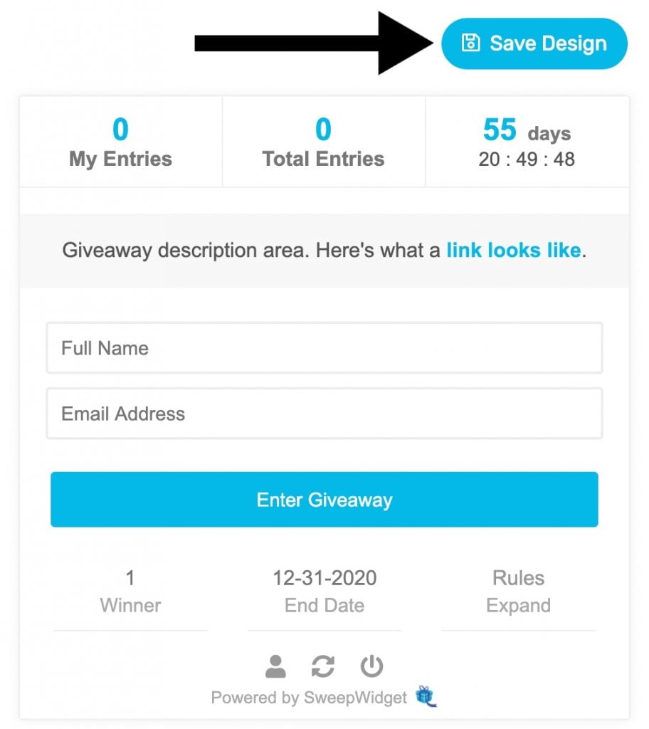
Your style will also be saved if you Save & Preview the widget.
